
How to Use Logi Symphony To Build a Managed Dashboard

Simba helps builders embed trusted intelligence into every product, so they can deliver consistent, trusted answers in a world running on AI.
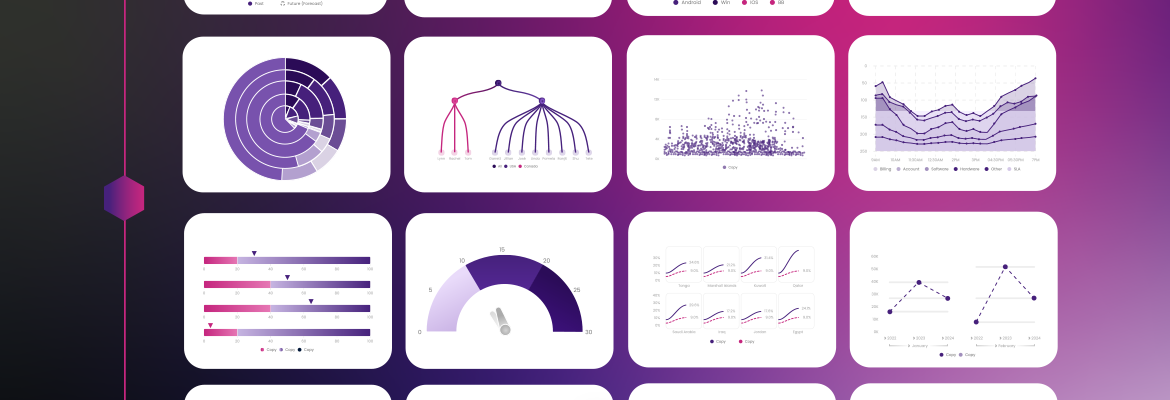
According to the Embedded Analytics Insights Report conducted by Hanover Research and insightsoftware, 85% of application developers found managed dashboards to be of key importance in an embedded analytics solution they buy. A managed dashboard is a pre-built, fully designed dashboard that delivers specific insights to users out of the box, without the need for self-service configuration.
This is for good reason, as offering embedded analytics features in your application remains a key way to differentiate yourself from your competition. When your organization includes managed dashboards, you provide your users with an easily accessible and trusted way to open up your application and get immediate answers to their most pressing questions.
In addition to the analytics and pixel-perfect reports in insightsoftware’s Logi Symphony offering, the embedded analytics tool allows you to quickly build managed dashboards that help users clearly see trends in their data that inform crucial decisions.
17 Dashboard Design Tips for Non-Designers
View resourceUnderstanding the Difference: Managed Service Dashboards and Self-service Dashboards
When it comes to dashboards, there are usually two schools of thought: self-service dashboards that users can build themselves, or finished dashboards, or managed dashboards, which are built for the user. There is no right or wrong choice, with a place for each approach. Self-service dashboards are fantastic when you have a lot of data to explore, and the conditions are not yet well defined. They typically follow in phase two, giving advanced users additional flexibility to explore on their own. Managed dashboards, on the other hand, are just as valuable because they give users exactly what they need without forcing them to do extra work to get to the data. They provide an easy, ready-made entry point that delivers trusted insights from day one. The following chart lays out the core differences between the two:
Evaluating Factors | Managed Dashboards | Self-Service Dashboard |
Best For | Recurring questions | Open-ended exploration |
User Effort | Minimal effort, ready at login | More effort, users must configure their views |
Customization | Usually less customizable, but it depends on the solution | Highly customizable |
Ideal Phase | Phase 1: out of the box | Phase 2: advanced users |
At insightsoftware, a managed dashboard is more than a prebuilt template. It is precision-perfect, designed to spec, and gives you full control over layout, branding, and functionality. Instead of poor templates or a cluttered layout, insightsoftware’s managed dashboards are built to deliver the exact answers your users need, as soon as they need them.
Your Step-by-Step Guide To Building a Managed Dashboard With Logi Symphony
When done well, managed dashboards can be the ideal dashboard form. In an embedded analytics scenario, you likely already know what your users want, and in many cases, they’re already asking for it. Delivering those dashboards out of the box, instead of forcing users down the self-service rabbit hole, creates a more streamlined experience. With Logi Symphony, you can quickly build managed dashboards that not only highlight trends and KPIs but also help your users make better, faster decisions. Let’s show you how easy it is to build a managed dashboard in Logi Symphony.
Step 1: Connect Your Customer’s Data and Choose a Template
The first step is to connect your customer’s data to Logi Symphony. Once it’s connected, you can click on the “Create” button and choose a template. You may also use this option to create a brand-new template.
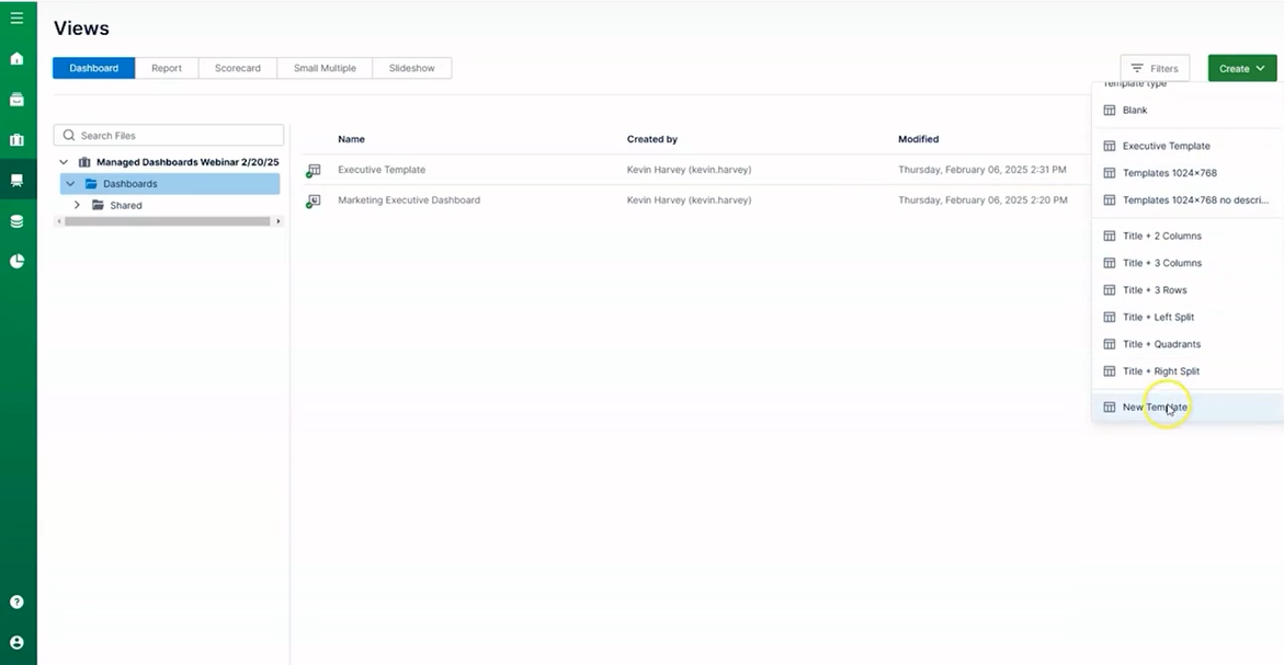
To create a new template, click on “Create” and select the “New Template” option. Each template includes an array of customizable components. The components themselves come with customizable options so that each block will stand out.
Step 2: Populate Your Blocks with Data
To populate a block, navigate to the Properties panel. There, you’ll find options to change various aspects of the design, such as layout, spacing, and color. You can choose a color straight from the app or input your own. This option lets you customize the look and feel to fit your end users’ unique branding.
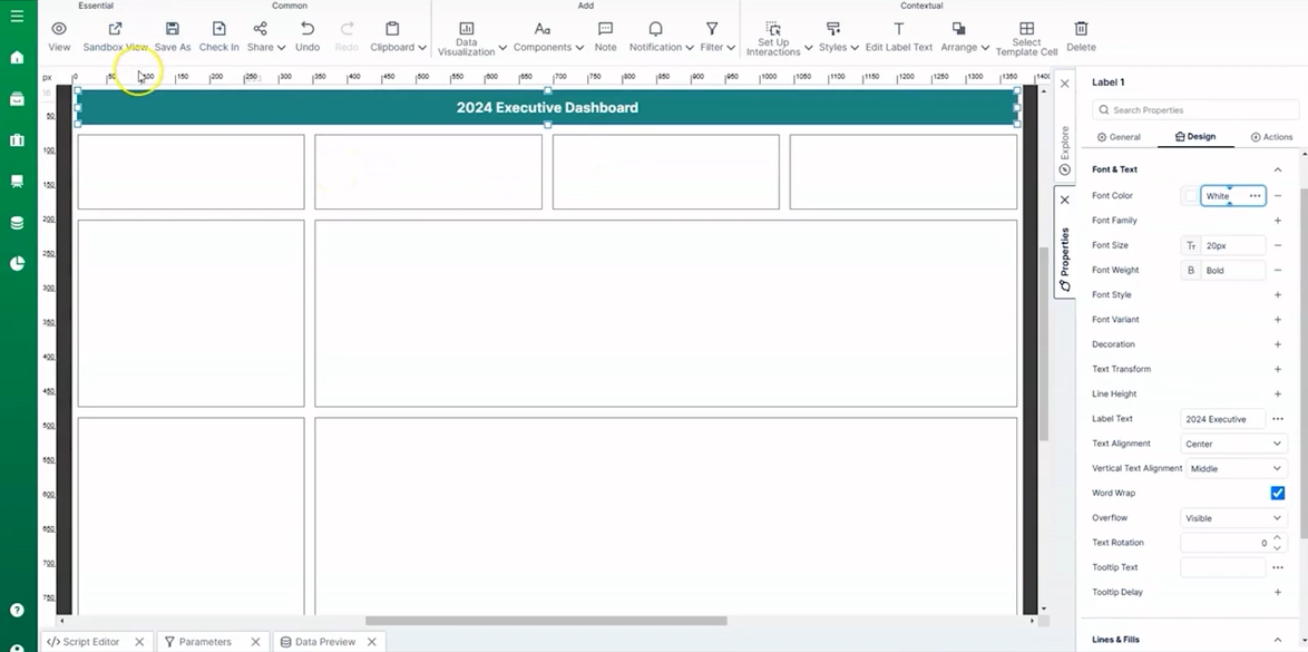
To add data to the dashboard, begin by dragging and dropping components. Once the data is filled into the tile, Logi Symphony provides a variety of different options and visualizations to choose from under the properties tab.
Step 3: Adjust Design Elements
Once you’re in the Properties tab, you can adjust design elements such as color, font, decoration, and more visualization options.
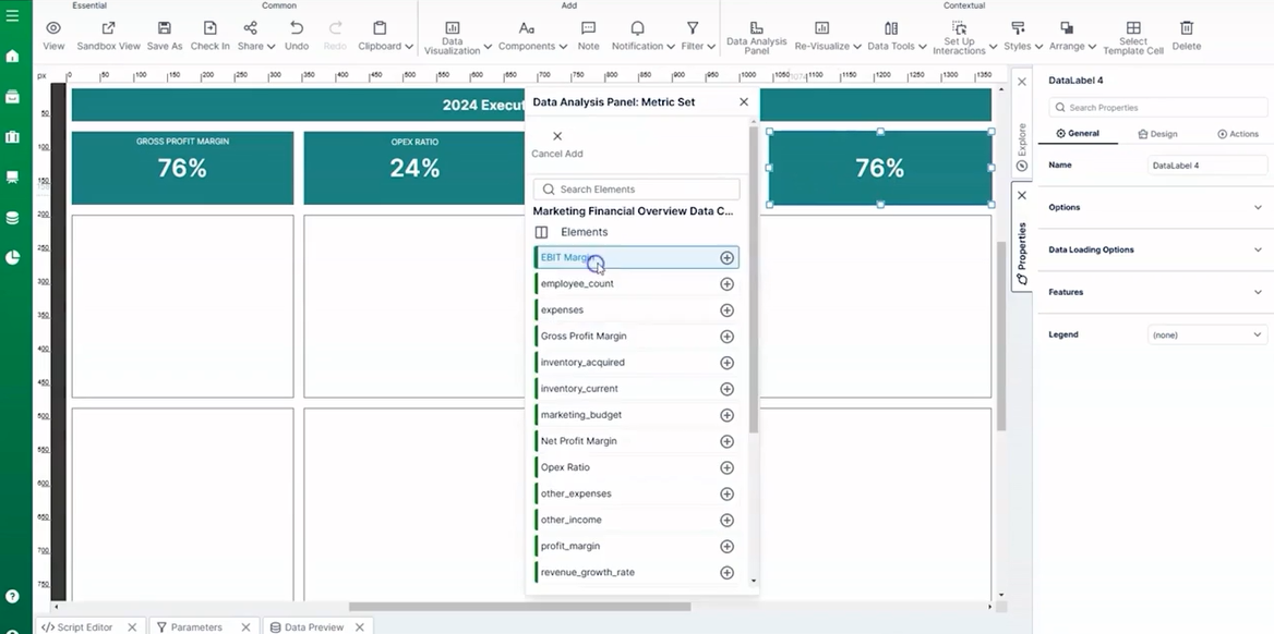
Logi Symphony also has reusable components, meaning you can duplicate any element you create in one dashboard or report and use it in another.
Step 4: Create Visualizations Using Your Users’ Data
Once you’ve completed the above steps, you will be able to easily visualize your users’ data in each managed dashboard.
Let’s say you want to add a chart. You could navigate to the “Explore” tab and select “Data Cubes.” Drag and drop your data into a free space. From here, use the options in the “Explore” tab to select specific details you’d like to include. For example, you can create a month-to-month chart by selecting “financial year,” then selecting “month.”
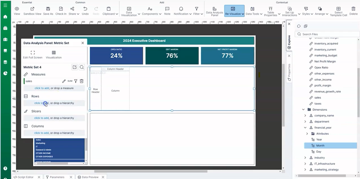
This will populate a chart into the block you’ve selected. To change the type of chart, navigate to the "Re-visualize" button at the top and select the type of chart that best suits your dashboard. Using the properties panel, you can continue customizing the look of your chart.
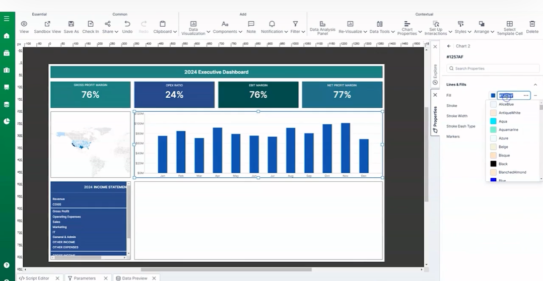
Step 5: Broaden or Specify Your Data
Your customization options don’t end there. For any data you pull into Logi Symphony, you can make your dashboard as broad or detailed as your users need. For example, if you want to make a chart based on expenses, navigate to the explore panel and drag “expenses” into an open section.
On the Data Analysis panel, find the “Slicers” row and hit “click to add.”
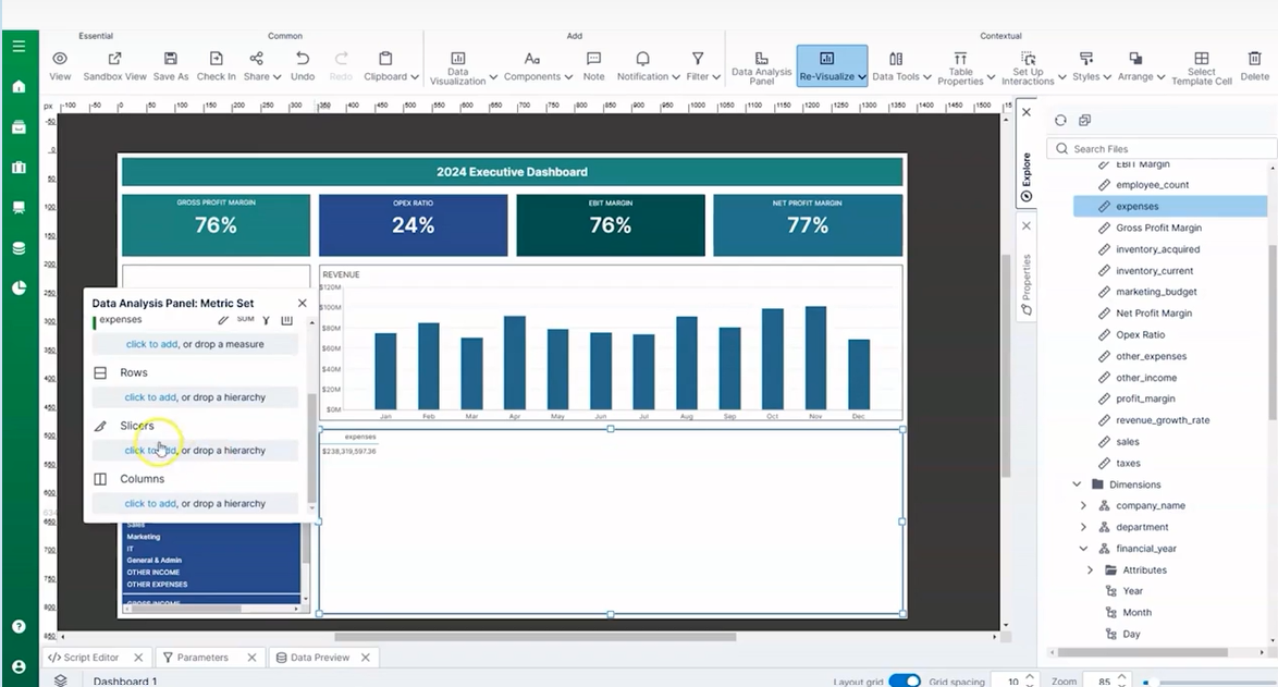
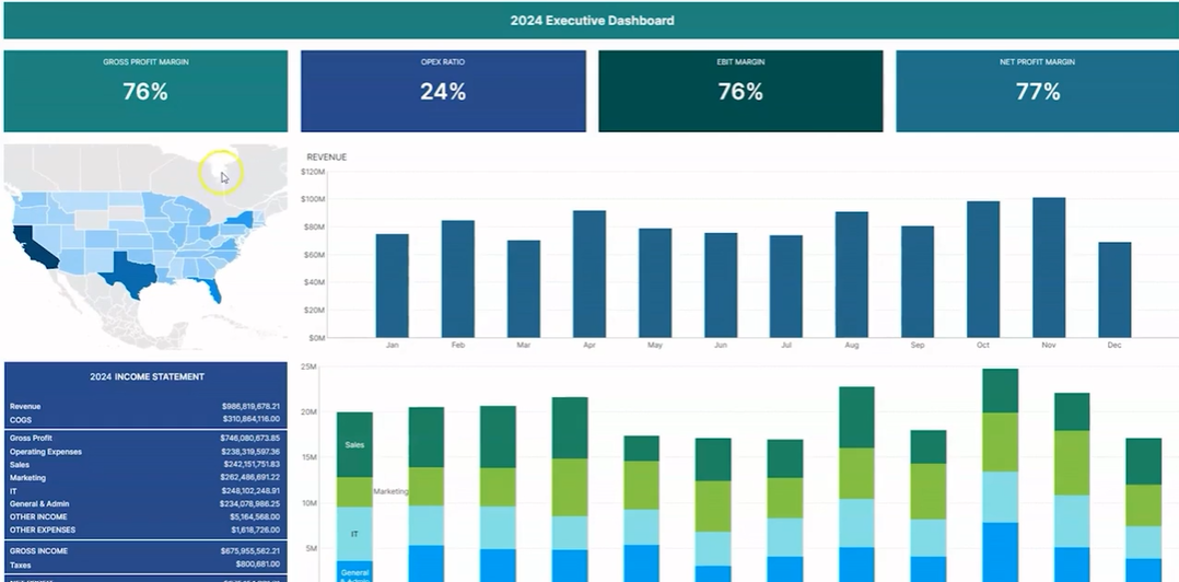
This option allows you to select different metrics, such as day of week, industry, by month, and more. To add departments, navigate to the Data Analysis Panel Metric Set box and click “columns (series).” Then, select “departments” and the data will auto-populate into the section you selected.
Sign Up for Logi Symphony to Get Started With Managed Dashboards Today
Managed dashboards are more than just a design shortcut. They represent the clearest, most intentional way to deliver value in an embedded analytics scenario. While self-service dashboards shine when conditions are undefined, and users want to explore freely, managed dashboards give customers exactly what they need from the moment they log in.
Oftentimes, the best outcomes come from using both. Start with managed dashboards to provide a trusted, out-of-the-box experience that answers the questions your users are already asking. Then layer in self-service dashboards for phase two, giving advanced users the freedom to dig deeper and create new perspectives.
With Logi Symphony, you have the tools to deliver both approaches. You can design dashboards that are precision-perfect and branded to spec, while still giving users the flexibility to explore when they need it. This balance is exactly what makes embedded analytics so powerful.
Ready to learn more? Sign up for a demo or watch our webinar on how to build a managed dashboard in Logi Symphony.