
Data Visualization


AI-First Data Visualization Tools Integrated for Real-Time Insights
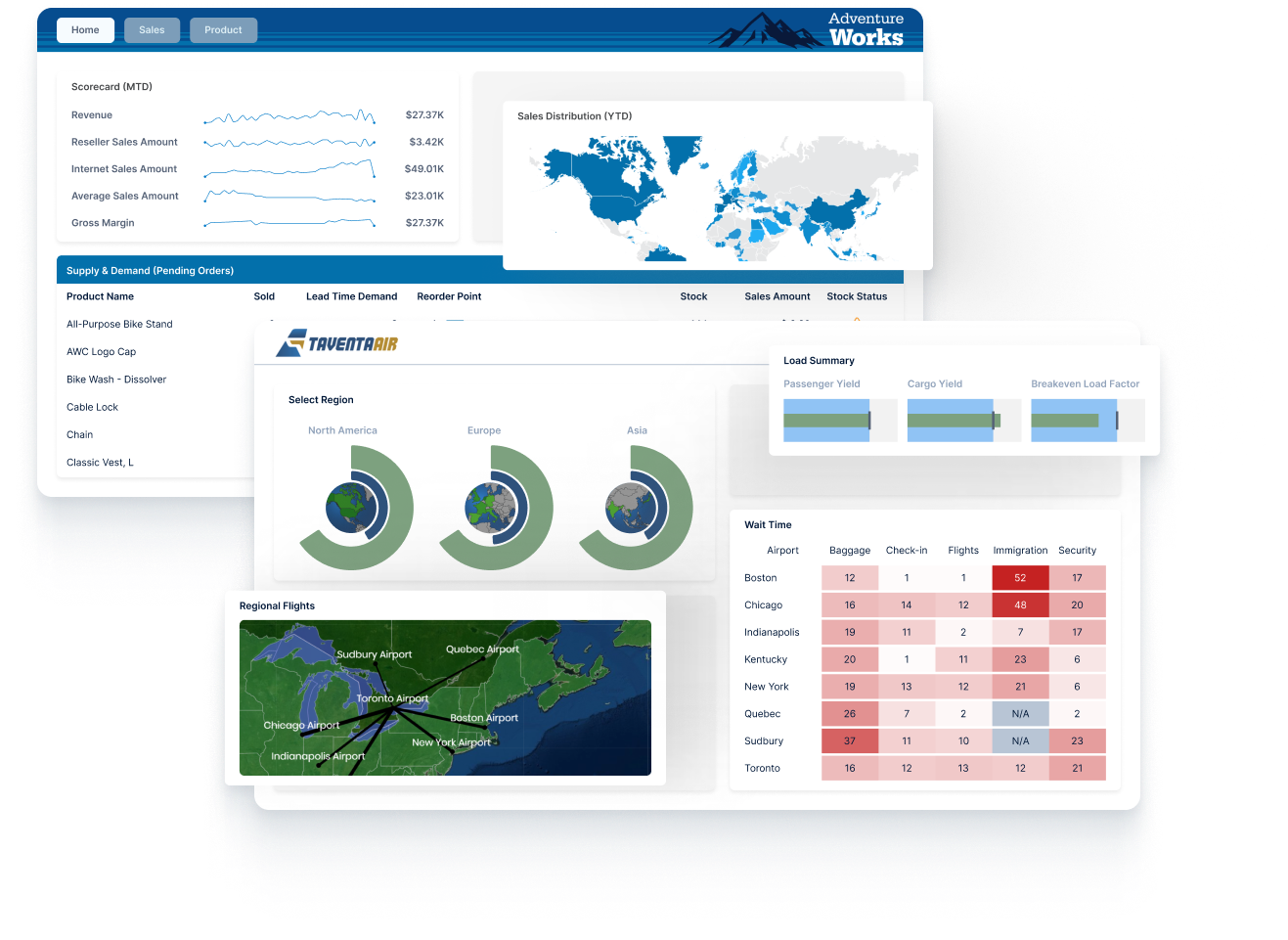
Logi Symphony and our data visualization tools deliver powerful, AI-first charts, diagrams, and graphs that can be integrated with your workflows. insightsoftware visualization solutions turn real-time data into stunning white-labeled dashboards and predictive charts for instant action.
DATA VISUALIZATION SOFTWARE
Create Stunning Visualizations With Our Tools
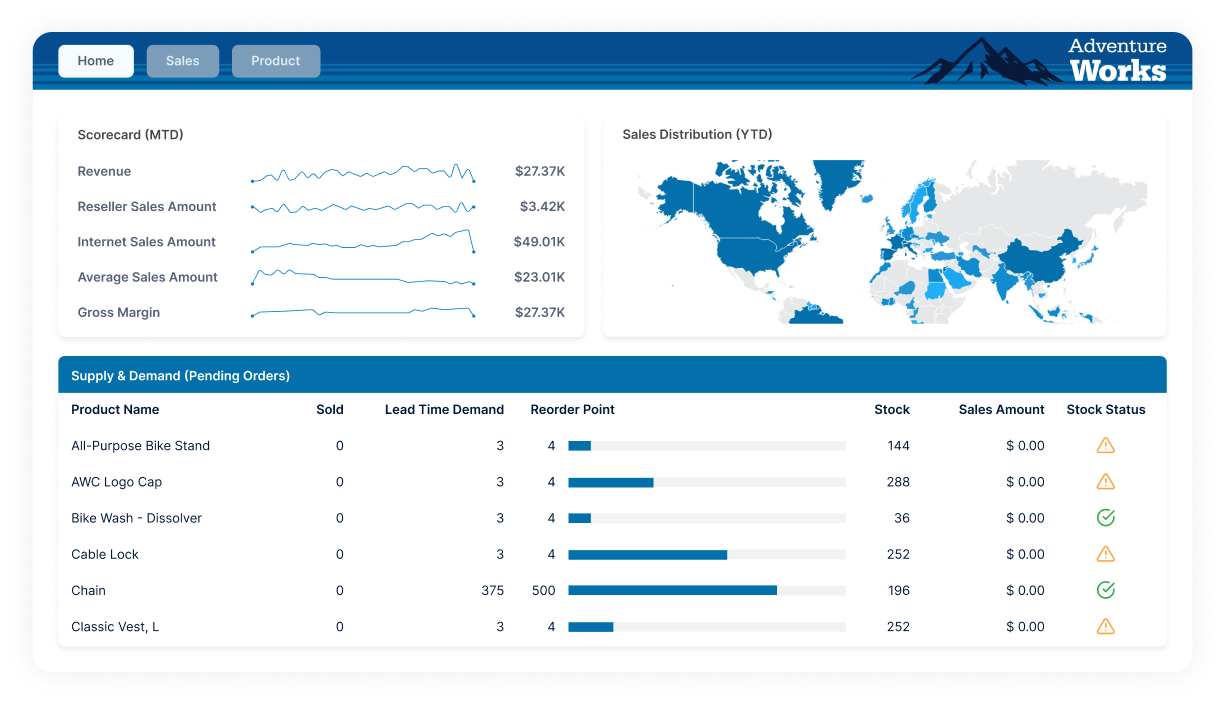
Tailored embedded analytics and reporting
Logi Symphony is modern BI software that allows software vendors and enterprises to augment any application with AI-infused analytics
AI SOLUTIONS FOR DATA VISUALIZATION
AI-First Visualization: Custom & Real-Time
Logi Symphony redefines what is possible in data visualization and BI, delivering 85+ AI-ready controls (charts, gauges, maps, and diagrams) that you can customize through thousands of properties. Stream real-time data from any source, apply predictive formulas, and embed dashboards in your apps for instant insight.
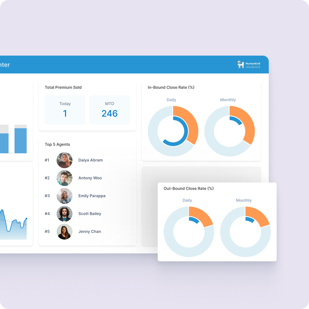
We Connect to 200+ Data Sources
















DATA VISUALIZATION USE CASES
AI-Powered, Real-Time Visualizations & Smarter Insights
Turn real-time data into clear, AI-guided insights. Build predictive dashboards, spot trends instantly, and surface actionable insights from within any app, so decisions stay ahead of the curve.

Create smart, data-driven visualizations with AI
Create smart, data-driven visualizations with AI
Predict trends and analyze data accurately
Predict trends and analyze data accurately
Integrate real-time data for up-to-the-minute insights
Integrate real-time data for up-to-the-minute insights


Based on980+reviews
"We love the little things like the timeline, undo, click to exclude, or zoom in. It’s just enough UI sizzle that seems to be pretty…
Based on980+reviews
"The ability to bring your own data and mix it with our platform data really sets us apart from our competition. No longer do our…
Based on980+reviews
Before Logi Symphony, it took controllers about 3 hours every day to sort out deliveries for that particular day. Now it takes 5 minutes to…

ROLES & INDUSTRY
Data Visualization Software Built for Any Role or Industry
Data Analysts
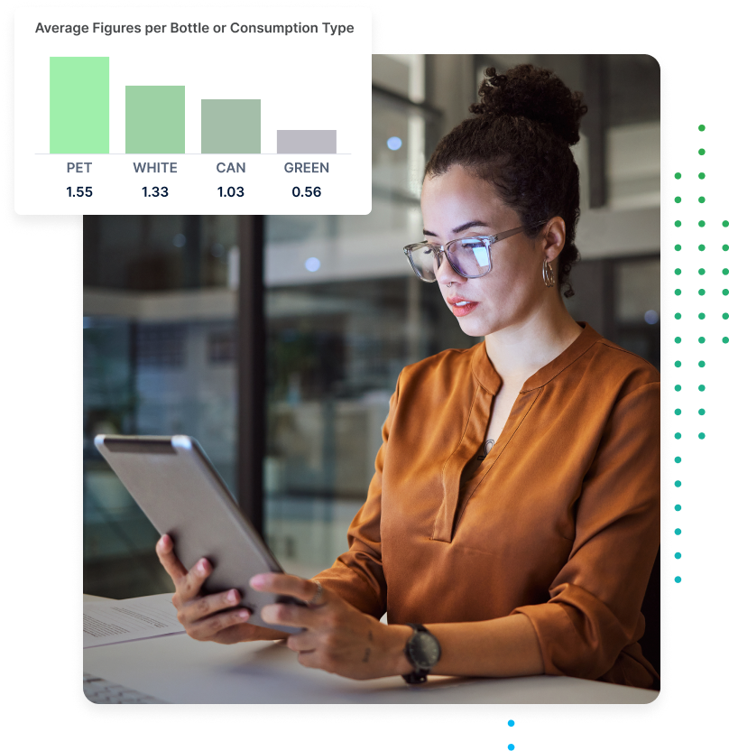
Quickly surface insights that matter. Drag and drop visual controls, let AI recommend the right chart, and drill from summary to detail in seconds. Logi Symphony accelerates analysis and sharing so analysts deliver answers before stakeholders even ask.

Business Users
Explore live metrics without a data team. Ask natural language questions, get charts back instantly, and follow guided highlights that explain what changed and why. See the story, act fast, and skip the spreadsheet shuffle.

Web Users
Give visitors interactive dashboards they can trust. Logi Symphony embeds in portals and apps, loads fast on any device, and keeps viewers engaged with filters, tooltips, and export options for deeper dives.

Developers
Build pixel-perfect analytics into products with our SDK, APIs, and open standards. Theme every element to match your UI, stream data in real time, and rely on enterprise security that passes the strictest audits.

Healthcare
Unify EHR, device, and claims data in one secure view. Track patient flow, staffing, and clinical KPIs in real time while AI identifies anomalies and predicts resource needs. Improve outcomes and compliance without extra clicks.

FinTech
Visualize trades, balances, and risk in milliseconds. Logi Symphony streams tick data, flags fraud patterns, and alerts teams before losses mount. Built-in governance keeps regulators and customers confident.

Manufacturing
Unify plant data, sensor feeds, and ERP reports in one dashboard. See live throughput, inventory, and quality KPIs, then let AI flag anomalies and predict maintenance needs. Faster insight keeps production lines running, waste down, and margins up

Science & Technology
Aggregate experimental, sensor, and SaaS data in unified dashboards. Spot trends in real time, model outcome scenarios, and share findings with collaborators on any device. Accelerate discovery while keeping IP secure.
Featured Blogs
Read and watch the latest resources for finance and operations professionals looking to get inspiration on how to improve their processes.

Blog
How Logi Symphony’s Embedded AI Streamlines Analysis
From natural language chatbots and custom chatflows to seamless deployment, learn how Logi Symphony’s embedded AI analytics works to streamline…
Read More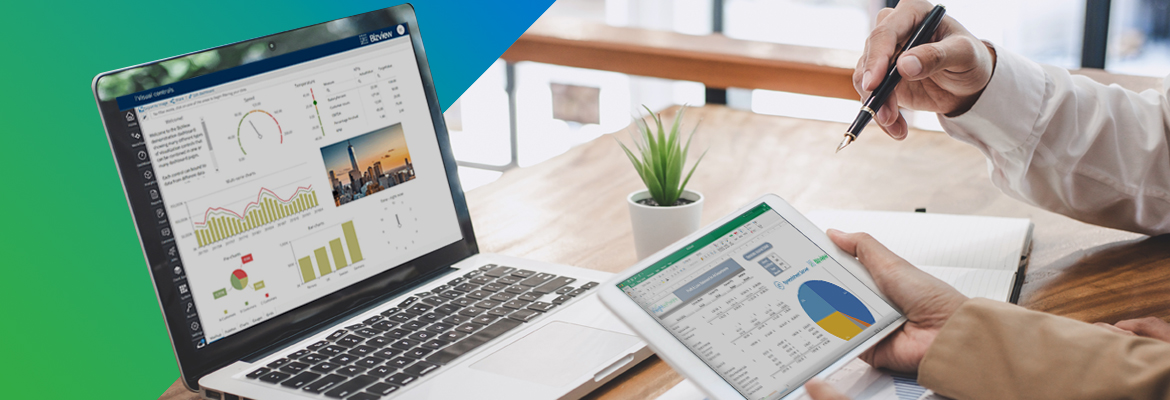
Blog
Ultimate Dashboard Design Guide: Top Trends, Examples, & Best Practices
Build and create business dashboards that do more than look good. Discover layout tips, design trends, & inspiring examples that…
Read More
More Data Visualization Resources
Data Visualization Software FAQs
What is data visualization?
As the name suggests, data visualization is the process by which quantitative or qualitative information is translated into visual representations (e.g. charts, graphs, maps, dashboards, etc.). These visual representations make it faster and easier for users to explore, understand, and interpret patterns, trends, relationships, anomalies, and overall performance structure. In essence, data visualization turns complex information into insightful visual stories.
What are the four types of data visualization?
- Comparison (bar chart, line chart)
- Distribution (histogram)
- Composition (pie chart, stacked bar chart)
- Relationship (scatterplot)
Learn more about the various types of data visualizations here.
What is the primary purpose of data visualization?
Why is data visualization important?
What are the business benefits of data visualization?
- Enables faster, more confident decisions via accelerated insights.
- Facilitates better alignment via shared dashboards that create a single source of truth.
- Enhances productivity via embedded analytics (like Logi Symphony) to deliver insights within apps that users already work from.
- Increases operational and financial agility via real-time discovery of patterns to act more quickly.
How can data visualization improve decision-making?
What are the benefits of interactive data visualization?
How much time does it take to create my first interactive visualization with insightsoftware?
How do I choose the right data visualization?
| Goal | Visualization |
| Comparing values | Bar/line charts |
| Showing a distribution | Histograms |
| Showing a makeup/composition | Stacked bars, pie chart, treemaps |
| Showing correlation | Scatterplots |
What makes a good data visualization?
- Avoid distortions and misleading scales
- Prioritize context with axes, labels, and baselines
- Encourage exploration without distraction
What are best practices for choosing colors for my data visualizations?
What are common mistakes to avoid in data visualization?
What are data visualization tools?
- Simba drivers for enterprise-grade data connectivity
- Vizlib for advanced Qlik Sense visuals (and interactivity)
- Logi Symphony for embedded analytics across your work apps
What are the latest trends in data visualization tools?
How can I choose the right data visualization software?
- User Experience: Can non-technical users easily create dashboards using intuitive features like drag-and-drop or pre-built templates?
- Data Connectivity: Does the data visualization tool support your data sources (e.g. cloud apps, databases, files, etc.)?
- Branding/White-Label Flexibility: Can you customize the appearance of your data visualizations to match your branding?
- Performance: Does the tool slow down with larger data volumes, concurrency, and other scaling expectations?
- Collaboration: Are users able to discuss, annotate, or act within dashboards to align on insights and findings?
- Security/Governance: Does the software support security features like role-based access, SSO, audit trails, and more?
How do I integrate MongoDB with data visualization tools?
What tools work best for MongoDB data visualization?
What insightsoftware platforms are best for data visualization?
What sets insightsoftware data visualization tools apart from other options?
How much data can insightsoftware tools handle?
What collaboration features are available?
Can I white-label or brand insightsoftware visualizations as my own?
Can I embed visualizations into internal dashboards or external websites?
How can forecasting and analysis tools improve my data insights?
How secure is my data when using insightsoftware visualization tools?
What data sources can insightsoftware visualizations use as the source?
- Out-of-the-box connectors: Seamlessly integrate with all major data sources, including traditional databases, big data, flat files, and streaming web data.
- Plugin connectivity: Utilize standards-based technologies like Simba for expanded connectivity.
- Programmatic retrieval: Fetch data programmatically for custom solutions.