
Pareto Charts – The Vital Few vs. The Trivial Many

insightsoftware is the most comprehensive provider of solutions for the Office of the CFO. We turn information into insights, empowering business leaders to strategically drive their organization.
Pareto Charts are powerful tools for identifying the most significant factors in a dataset, enabling businesses to prioritize their efforts for maximum impact. By visualizing data in a clear and organized manner, these charts help teams quickly pinpoint areas that require attention, facilitating more efficient problem-solving and decision-making. Whether analyzing product defects, customer complaints, or other operational issues, Pareto Charts provide valuable insights that drive continuous improvement and strategic focus.
What are Pareto Charts?
A Pareto Chart is a type of visualization that combines bars and a line graph. Individual values are represented by bars in descending order, while a cumulative total is shown by a line graph that moves from left to right. The line starts at the top of the first bar and continues to the right, showing the cumulative percentage of the total as each bar is added. By the final bar, the line reaches 100%, representing the cumulative share of all items in the chart.
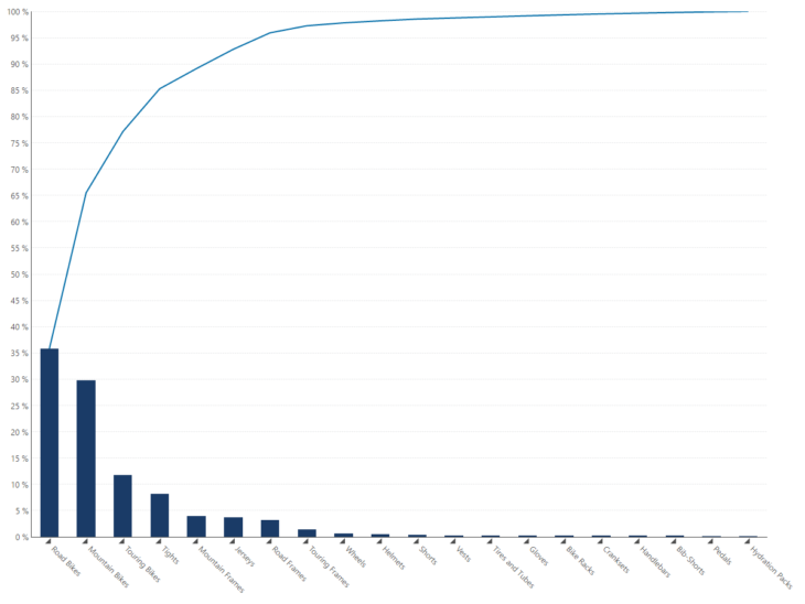
Figure 1 - Example of a Pareto Chart created in Dundas BI
The chart is a derivative of the Pareto principle, which states that, for many events, roughly 80% of the effects come from 20% of the causes. This principle is named after Italian engineer, Vilfredo Pareto, who observed that 80% of the land in Italy was owned by 20% of the population. The principle was further developed, as Vilfredo observed that roughly 20% of the peapods in his garden contained 80% of the peas.
The Pareto Chart, derived from a histogram, views causes of a problem in order of severity from largest to smallest, ultimately demonstrating the Pareto principle. With a Pareto Chart, you are able to highlight the most important among a large set of factors. The most prevalent use case is for quality control, be it identifying the most common source of defects, the highest occurring type of defect, the most frequent reason for customer complaints, and so on. However, this visualization can easily be applied to other events, such as business, where 80% of profits are regularly elicited from 20% of products.
Pareto Charts Use Cases
Pareto Charts are widely used across various industries to identify and prioritize the most significant factors in a given dataset. One common use is in quality control, where businesses utilize Pareto Charts to pinpoint the most frequent defects or issues, allowing them to focus on the areas that will have the greatest impact on product quality. Another powerful application is in customer feedback analysis, where companies can categorize and visualize customer complaints, helping them to address the most common concerns first.
Additionally, Pareto Charts are employed in inventory management to determine which items contribute most to sales or costs, enabling more strategic inventory control. These charts are also valuable in process improvement initiatives, where they help teams identify and eliminate the most critical bottlenecks, driving efficiency and effectiveness.
Hypothesizing based on Word Frequency
As noted, Pareto Charts are not used solely for the purpose of quality control. Many natural phenomena have been shown empirically to exhibit such a distribution. For example, we can use a Pareto Chart to hypothesize, based on the Pareto principle, that the frequency by which a word occurs in a novel is a strong representation of what or whom the story is centered upon.
Using public data from Emil Johansson’s Lord of the Rings project, I’ve compiled a list of the 26 most referenced characters in J.R.R. Tolkien’s, The Hobbit, along with the number of times each character was referenced.
Before displaying this data set in a Pareto Chart, I’m going to visualize it as a Pie Chart. The purpose of this exercise is to explain that although Pie Charts are often a common choice to visualize the share distribution of categories, there are many instances where they are far less effective in displaying this information.
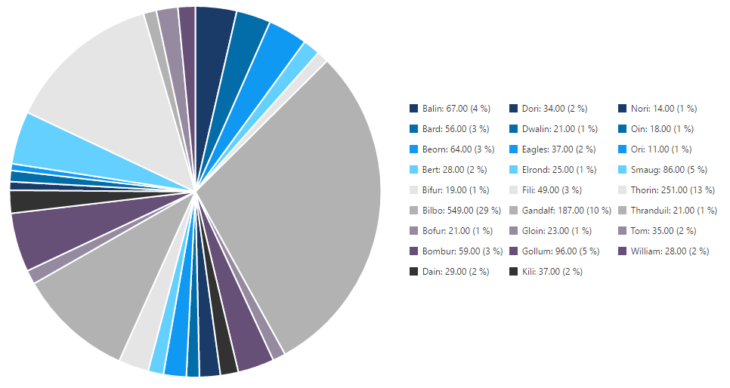
Figure 2 - Pie Chart created in Dundas BI, visualizing the frequency by which a character is referenced
Research has found that it is extremely difficult for people to accurately discern the differences between 2-dimensional areas, such as pie slices, as opposed to comparing lengths, such as the lengths of bars. It is also difficult to accurately identify which slices reference which category, as the viewer must constantly alternate from viewing the legend and the chart. Matters are made more difficult, as with large numbers of categories, the differences in slice colors are often very subtle.
Now, let’s re-visualize the same data set, in a Pareto Chart.
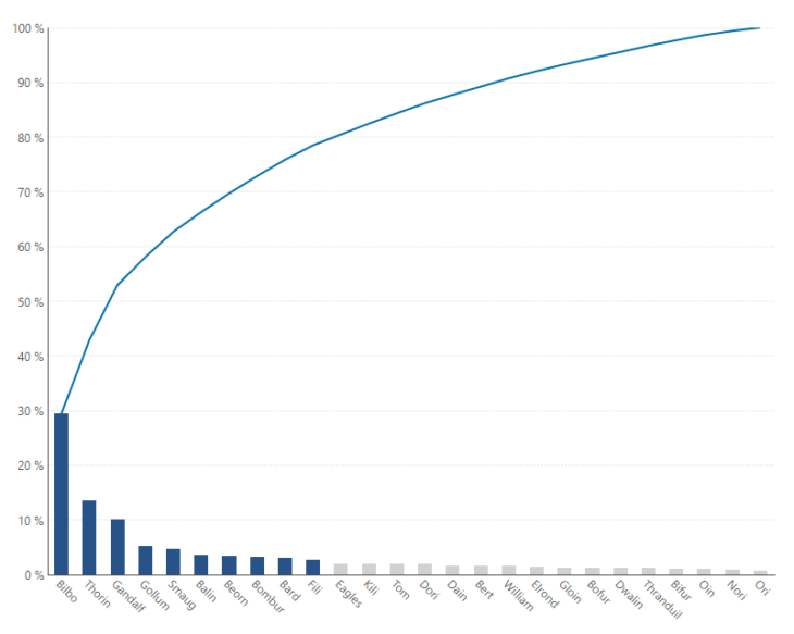
Figure 3 - Pareto Chart created in Dundas BI, visualizing the frequency by which a character is referenced
At a glance, this tells us a number of things. The bars/columns show the occurrence of an event (in this case, the frequency by which characters are referenced), while the line shows the cumulative percentage. The Pareto Chart very clearly emphasizes the relative sizes of each value, as opposed to the Pie Chart. We are also able to instantly identify which characters have been referenced the most (Bilbo, Thorin and Gandalf), which allows us to focus on the most important categories (thus differentiating between the ‘vital few’ and the ‘trivial many’).
Our final image, is the same Pareto Chart above, however it has been zoomed-in, to reflect the 6 most referenced characters. This chart also includes a ‘tooltip’, where upon hover, the user can easily understand the total quantity of a value, the percent of the total that the value pervades, and its cumulative percent.
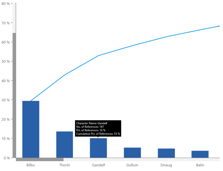
Figure 4 - Zoomed-in Pareto Chart created in Dundas BI, visualizing the frequency by which a character is referenced
The Pareto Chart does an incredibly good job of correcting a Pie Chart’s inefficiencies when it comes to understanding the share of many different items, and allows the user to make a much better claim on our hypothesis that the frequency by which a character is referenced is a strong representation of what a novel focuses on. Based on our discovery, we can easily identify which of the 26 main characters, 80% of the plot is likely centered on. In this case, we’ve identified 10/26, or 38% of the characters, which, albeit while not perfectly aligned to the 80/20 rule, is still an accurate representation of who the main characters are.
Healthcare Improvement: Using Pareto Charts to Enhance Patient Safety
Pareto Charts are essential tools in the healthcare industry for improving patient safety and care quality. Healthcare providers use Pareto Charts to analyze data related to patient safety incidents, such as:
Medication errors
Surgical complications
Adverse events
By identifying the most frequent and severe issues, such as incorrect dosage administration, healthcare facilities can implement targeted interventions, including:
Additional staff training
Revised protocols
Automated dosage systems
Prioritizing these efforts based on Pareto Chart analysis helps reduce the occurrence of errors, leading to better patient outcomes and increased trust in healthcare services.
Sales and Marketing Optimization: Leveraging Pareto Charts for Maximum ROI
In sales and marketing, Pareto Charts are invaluable for optimizing resource allocation and maximizing return on investment (ROI). Businesses often run multiple sales channels and marketing campaigns with varying levels of success. By applying Pareto Chart analysis, companies can identify which channels generate the most revenue or which campaigns yield the highest conversion rates, such as:
Targeted email campaigns
Social media ads
This insight allows companies to:
Focus their budget and resources on the most effective strategies
Scale successful campaigns
Reduce spending on less impactful areas
Ultimately, this strategic focus improves overall business performance.
When to Use Pareto Charts
Pareto Charts are most effective when you need to identify and prioritize the most significant factors in a dataset. They are particularly useful in scenarios where:
Identifying Root Causes: You need to determine the most common causes of defects, errors, or issues in quality control or process improvement.
Prioritizing Problems: When resources are limited, and you need to focus on solving the most impactful problems first.
Analyzing Customer Feedback: To identify the most frequent customer complaints or feedback, helping you address the most critical issues that affect customer satisfaction.
Evaluating Sales Performance: When you want to analyze which products, services, or sales channels contribute most to revenue, allowing you to focus on the most profitable areas.
Pareto Chart Procedure
Creating a Pareto Chart involves a systematic procedure that ensures accurate and meaningful insights:
Data Collection: Gather data on the categories or issues you want to analyze. This could be defects in a manufacturing process, types of customer complaints, or sales data.
Organize Data: Sort the data in descending order based on the frequency or impact of each category.
Calculate Cumulative Percentages: Calculate the cumulative percentage for each category, which will be represented by the line graph on the Pareto Chart.
Create the Chart: Plot the data with categories on the x-axis and frequency or impact on the y-axis. The bars represent individual categories, while the line graph shows the cumulative percentage.
Analyze the Results: Use the chart to identify the "vital few" categories that contribute most to the issue or outcome, allowing you to focus on these areas for improvement.
Why Use a Pareto Chart?
There are several compelling reasons to use a Pareto Chart in your analysis:
Simplified Decision-Making: Pareto Charts make it easy to identify the most significant factors, enabling you to make informed decisions quickly.
Effective Resource Allocation: By focusing on the "vital few" categories that have the greatest impact, you can allocate resources more efficiently and effectively.
Visual Clarity: The combination of bars and a line graph provides a clear and intuitive visual representation of the data, making it easier to communicate findings to stakeholders.
Supports Continuous Improvement: Pareto Charts are integral to quality control and process improvement initiatives, helping organizations continually refine and enhance their operations.
You can also check calculated vs columns in Power BI to learn more about data visualization and financial reports presentation.