Data in Action
Browse real data visualizations below to see how easy and insightful data can be!
Fully interactive visualizations
- Drill down or across to reveal more answers from your data
- Explore trends over time and find outliers and anomalies
- See raw data details quickly with a few clicks
Real-Time Streaming and Data Playback
- Slide through time with a draggable time bar and play back data from any period
- Extend or reduce the time frame and zoom in for a more granular view of data
- Animate playback and see the shape of historical data change over time
Modern Data Sources
- Data Sharpening enables you to interact with data while the query is still processing.
- Connect to all data, including semi-structured and search-based sources.
- Search keywords and drill down for multidimensional analysis of data.
Custom Visualizations
- Customize and extend with Composer's APIs library
- Maintain complete control over the look and feel of your application
- Give custom visuals all of Composer's functionality
Visuals embedded inside your application
- Interact with visualizations and see how it changes elements in your application
- Interact with objects in your application to change the analytics dashboard
Select a name to see the number of babies with this name between January 1, 2018 and December 21, 2019.
Explore Real Dashboards
Baby Names Dashboard
Discover how Logi Composer's precise control over customization and self-service, coupled with an interactive time-bar help you explore over one hundred years of data on baby name trends going back to 1879.
Check Out Dashboard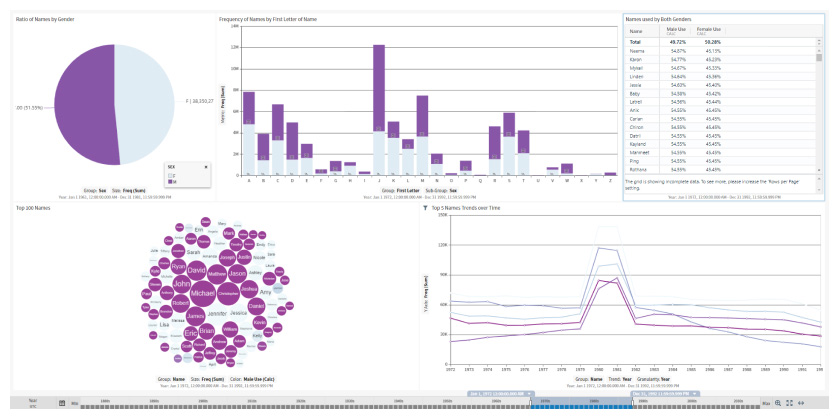
College Education Dashboard
Learn how interactive maps embedded in your application can be used filter data across the dashboard and compare college tuition costs and long-term income potential.
Check Out Dashboard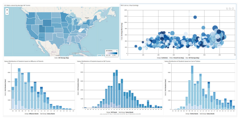
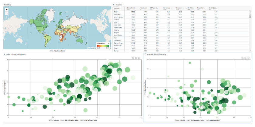
World Happiness Dashboard
See how to build and embed sophisticated multidimensional visuals enabled with self-service that provide insights into how citizens from 156 countries perceive their own happiness.
Check Out Dashboard