
Building the Ultimate Sales Dashboard

insightsoftware is a global provider of EPM, data analytics, and equity management software, helping finance, technology, and HR leaders make confident decisions in a world shaped by AI.
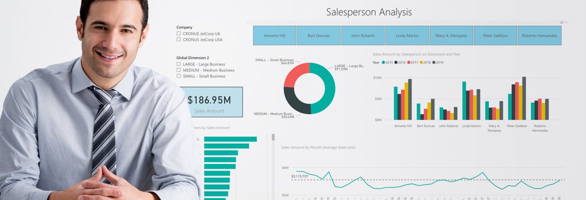
Data is the key to actionable decision-making. In a fast-paced environment like sales, you’re surrounded by it. From gathering customer data to monitoring sales status to tracking goals, salespeople are constantly collecting and using data. However, the challenge with having all of this data at your fingertips is organizing it in a way that lends itself to analysis and action. Without the right strategy and business intelligence tool in place, you won’t be able to derive meaningful insights from the data you work so hard to accumulate.
In sales, dashboards play a huge role in managing day-to-day operations, measuring performance, and adapting quickly to changing conditions. With a well-organized dashboard designed to meet a specific goal, a sales manager can take a glance at key metrics on a single screen and make speedy decisions based on facts. To set you up for success in analytics, we’ve created a detailed guide on how to create the ultimate sales dashboard. Keep reading for more insight on the sales metrics you should be tracking and the dashboards you should be using.
Our Recommendations for the Ultimate Sales Dashboard
Before we start, it’s important to understand that dashboards are often used by different parties with different priorities. Sales reps have a tendency to be more concerned with their own performances, while sales managers likely care more about high-level analyses that drive business decisions. It’s vital that sales managers are equipped for this to identify and prevent trends that could potentially result in efficiency challenges, as well as identify new opportunities for incremental revenues.
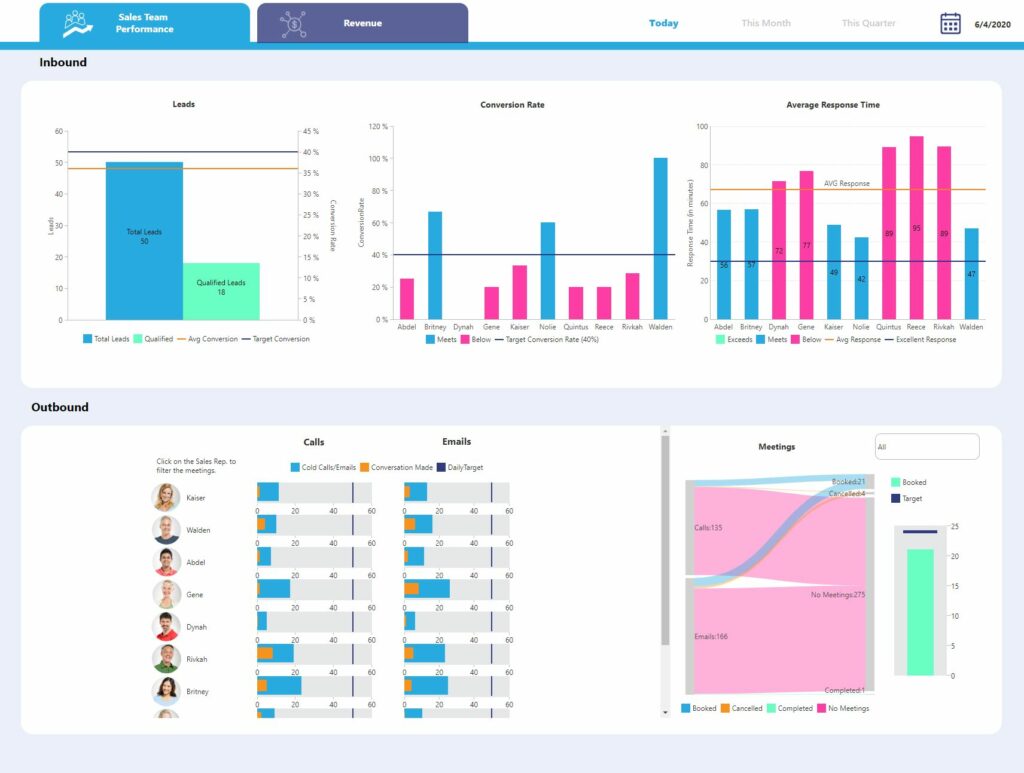
Figure 1: Sales Management and Revenue Dashboard Tab 1 – Sales Team Performance
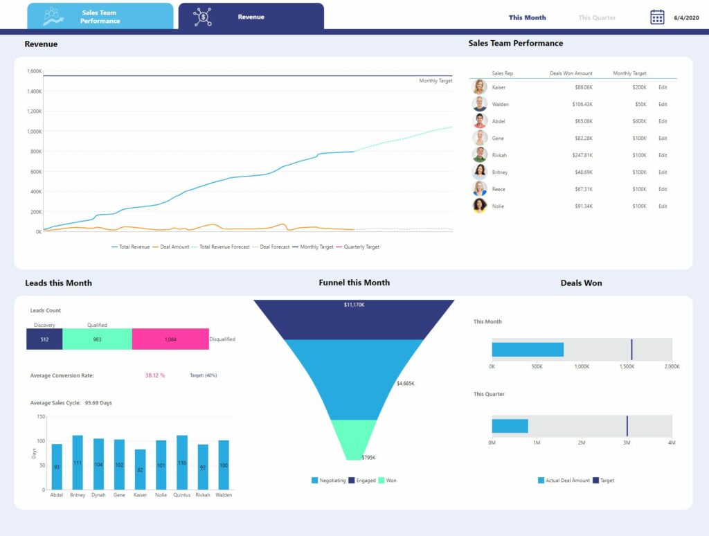
Figure 2: Sales Management and Revenue Dashboard Tab 2 – Revenue
The dashboard shown above is a highly effective view that equips sales managers with what they need to monitor performance, identify areas of improvement, and discover new opportunities for growth. This includes pipelines, revenues, conversion ratios, win-ratios, and more.
Not only is this highly detailed sales dashboard exhaustive in what metrics it reports on, it’s also highly interactive and contains an analysis feature that you likely won’t encounter anywhere else. Let’s take a closer look at each element of the dashboard and discuss what information is being shared and how sales managers can use these insights to diagnose performance issues.
Sales Team Performance Tab
You can think of the Sales Team Performance tab as being a direct extension or overview of the Individual Sales Performance Dashboard. This first tab of our dashboard aggregates all that information into one view, allowing sales managers to get a lay of the land and monitor the bigger picture.
At a glance, sales managers can visualize how each sales rep is performing in relation to their peers, identify where improvements must be made and action taken, and see whether the sales team has reached the targets set for them at daily, monthly, and quarterly intervals. This dashboard also helps sales managers set more realistic, attainable goals and empowers them to encourage and incentivize their team to perform as effectively as possible.
Inbound
What are we tracking?
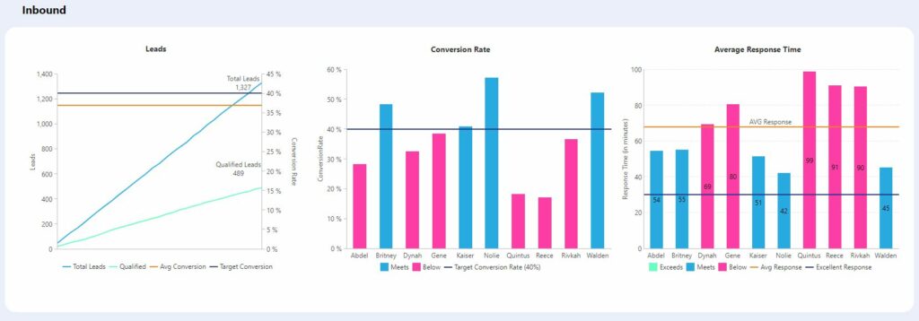
Leads | Lead Conversion Rate | Average Response Time |
|
|
|
Each of the KPIs in this section can be understood by all users and are easily actionable. The data changes in real-time, allowing sales managers to stay updated on the status of all Inbound activities.
Outbound
What are we tracking?
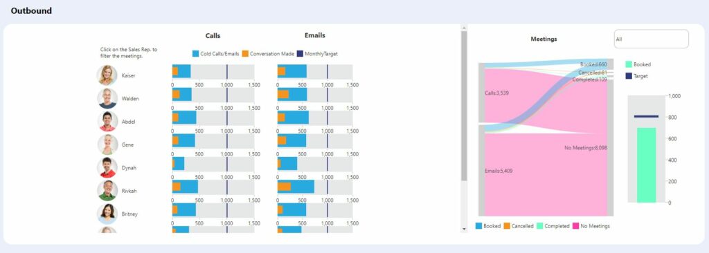
Calls | Emails | Meetings |
|
|
|
What’s unique about the Outbound section of this dashboard is the inclusion of the Sankey Diagram. This visualization is designed to show relationships in a flow, displaying how quantities are distributed among items between stages. In this example, it helps clearly show the volume of cold calls and emails that eventually became booked meetings, as well as those that did not.
By hovering on the diagram, sales managers can highlight the various flows (cold outreach to meetings booked, meetings cancelled, and meetings completed) and compare values. They can then select individual sales reps and filter on their data to take the analysis even deeper.
Revenue Tab
While individual performance metrics are undeniably important to track, every sales manager also needs to validate and quantify the impact their teams are having on revenue. After all, a sales team is only effective if it’s generating enough money to drive profit and overall business growth. This Revenue tab houses key financial metrics and is crucial for helping sales managers track progress and define success.
Revenue & Sales Team Performance
What are we tracking?
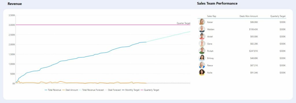
Revenue | Sales Team Performance |
|
|
It’s critical that sales managers are able to visualize and speak to how close (or how far) their teams are from hitting their targets. They need to immediately be able to see where they stand, lest they run the risk of veering from their targets. If the team is trending in the wrong direction, it’s important that managers have that insight to act and rectify the situation, as opposed to down the road when sales targets get completely out of reach.
Leads, Funnel & Deals Won
What are we tracking?
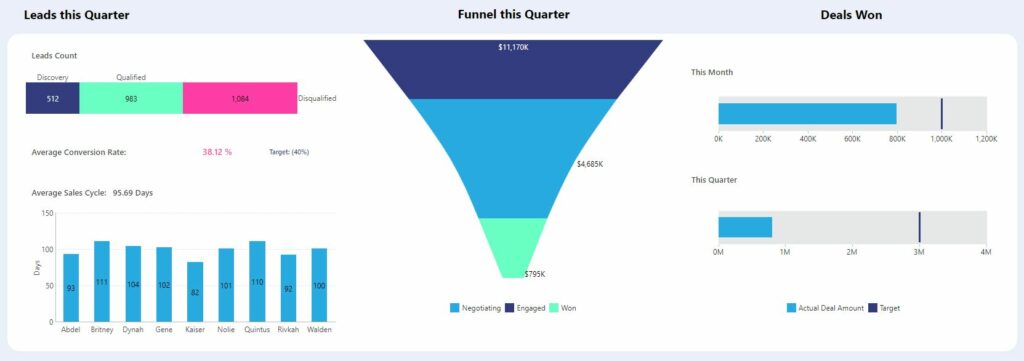
Leads this Quarter | Funnel this Quarter | Deals Won this Quarter |
|
|
|
This section simply grants sales managers another view into key metrics around leads and won deals. They can use these insights to determine at a high level whether their teams are qualifying enough leads at an effective speed. This part of your dashboard makes it easy and intuitive to track which stage of the funnel most potential revenue resides, and take any necessary steps to translate that into viable business opportunities.
The high-level insights derived from this particular dashboard should function as an entry point for deeper analysis and data exploration. Keep in mind that the majority of these metrics are backward-looking, meaning they will only inform whether goals have been met — not why the results are what they are.
Best Practices for Building Your Sales Dashboard
If you’re serious about creating and tailoring valuable dashboards for your own sales team, download our white paper on KPI dashboards or keep reading for additional best practices and recommendations below. We’ll go into more detail about what kinds of dashboards are the most effective for quick, informed decision-making and include some important tips to help you reach your sales quotas faster!
How to Build Useful KPI Dashboards White Paper
View resourcePinpoint the Purpose of Your Sales Dashboard
It may seem a little simple, but the first step to building a great sales dashboard is to identify who will be using this dashboard, how they’ll use it, and what information they want to gain. A sales rep might want a graphic dashboard that they can check daily to help meet their weekly goals. A sales manager might be after a more detailed dashboard to check top-performing sales reps every week. On the other hand, a sales VP might need just a simplified dashboard to show high-level revenue and sales every month. Put simply, generic dashboards are not as effective as specific, tailor-made dashboards for your team and their needs, so make sure you’re clear on the purpose behind your sales dashboard before diving in.
Sales Metrics You Should Be Tracking
A day in the life of a top salesperson revolves around tracking phone calls, nurturing prospects, and closing deals — meaning that sales teams are in a constant state of flux. Before building your sales dashboard, you need to identify your top goals and narrow down what KPIs and metrics are most important in reaching those goals.
A go-getting sales manager might set a goal of increasing sales by 5% this quarter, and therefore needs to monitor both individual and team performance to track progress and identify their top performers. An inside sales rep’s goal is to reach a target of 200 cold calls per month, so they are focused on tracking sales activities and completing tasks. Two very different goals, two very different dashboards.
A golden set of sales metrics and KPIs doesn’t really exist, as measurements differ from department to department. The general rule of thumb when choosing your KPIs and metrics is to tie them back to your goal. If it gives you useful information and identifies areas for improvement, you should track it.
According to an informative article by HubSpot, sales metrics typically fall into one or more of these categories:
Activity Sales Metrics (e.g. # of calls made, # of meetings scheduled)
Pipeline Sales Metrics (e.g. Average length of the sales cycle, total closed opportunities by month/quarter)
Lead Generation Metrics (e.g. Average lead response time, % of qualified leads)
Sales Outreach Metrics (e.g. Email open rate, engagement rate)
Primary Conversion Metrics (e.g. % of opportunities closed/won)
Channel Sales Metrics (e.g. Revenue by partner, Average deal size by partner)
Sales Productivity Metrics (e.g. % of time spent on selling activities or creating content)
Sales Process, Tool, and Training Adoption Metrics (e.g. Average cost of training by salesperson)
The bottom line is that the ultimate sales dashboards need to be designed with a specific role in mind, including their specific goals. It needs to be relevant, easy to read, and easy to adjust.
The Definitive Guide to Dashboard Design
Build Your Sales Dashboards with Business Intelligence Software
Once goals and metrics have been identified, you’re ready to start building the sales dashboard. Some capabilities may already be built into your CRM or ERP solution, but most of the time, they aren’t very user-friendly or practical. There are a ton of separate dashboard solutions out there to choose from, but we usually recommend you stick with a business intelligence (BI) solution that integrates with your current software. This is for a few reasons:
BI software is designed for self-service reporting and analytics – that means you shouldn’t need a developer every time you want to build or alter a dashboard.
Data consolidation will be automated, ensuring real-time information from multiple data sources so you don’t have to worry about stale information.
BI software comes with pre-built dashboards and chart options to choose from, so you can hit the ground running.
BI software allows you to drill down into key information and apply calculations within the tool itself.
If you decide against a BI solution (or a similar system that automatically syncs with your ERP system), this will be a more manual and time-consuming process. Going the more manual route means that you’ll have to build reports and dashboards from scratch and continually update them to reflect new data.
Create, Visualize, and Share Your Sales Data
Remember that the purpose of a dashboard is to be able to make decisions at a glance. BI software, like the platforms that insightsoftware offers, includes a wide range of templates to choose from and customizable charts to visualize your data. Pie charts, bar charts, line charts — really any kind of chart you can think of to tailor the tiles on your dashboard to your team’s preferences. That being said, it’s equally important not to overwhelm your user with too many fancy charts and clutter. There are a few design conventions to keep in mind before diving into your dashboard. The first is simplicity and usability. Color, images, buttons, fonts, charts, numbers, and every element of a dashboard should look and feel consistent to the user, so there is no confusion or issues with navigation. Another thing to keep in mind is that most of us read from left to right, so these dashboards should put the most pertinent visuals on the left to help quick interpretation. Just remember that everyone is different, so it’s a good idea to experiment a bit with these options to find what colors and charts work best for you and your team. The last major factor to keep in mind when building your dashboards is how you will access and share them. If you’re creating a sales leaderboard dashboard, for example, you want every member of the team to be able to easily view this dashboard from anywhere with an internet connection.
Learn more about the dos and don’ts of dashboard design in our comprehensive guide here.
Enhance Your Sales Dashboards with insightsoftware
Sales managers care deeply about exploring data and performing analyses that highlight trends in their data and dictate their decision-making. In today’s accelerating world, they need insights that help them quickly identify activities to correct and improve corporate results. Unfortunately, some dashboarding platforms make it confusing where to look for the right information and what their team’s next steps should be. insightsoftware provides sales managers with intuitive, powerful, and self-service dashboards that empower them to drill into and diagnose performance issues. Ready to see how insightsoftware can help your data visualization needs? Schedule a demo with our team today!
Get a Demo
Build lightning-fast embedded analytics experiences while accelerating time-to-value – without requiring additional engineering resources.